Dear Moderator,
Thanks for taking the time to look around my blog. My group blog is linked to this page aswell as links to my teachers blogs. Both are found on the left hand side, from which you can find links to the other members of my group's blogs.
On this blog you will find my individual research into music videos and the music industry and also a few of my planning and production work over the course of the project.
As you have probably noticed my music video and ancillary tasks have been posted at the top of the blog.
Use the labels, also on the left, to navigate my work. Enjoy at your leisure..
Thanks, Lewis.


Saturday, 17 December 2011
Question 1 - In what way does your media product use, develop or challenge forms and conventions of real media products?
To answer this question we have created a video response in which we highlight upon how we 'used, developed and challenged' forms and conventions of real media products to achieve our desired effect for both our main product (music video) and the two ancillary products (album cover and website) we created.
Here are some relevant videos which we 'used, developed and challenged':
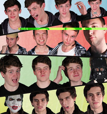
We drew particular inspiration from this video and adapted both its style and concept to our idea. The video has a very casual, 'proffesional home movie' style of camerawork in which we tried to use in our own video. The camerawork is often static, front on and has the actors directly addressing the camera representative of a 'webcam'. We decided to use similar shots within our video to create a similar professional yet home made feel to the video to create a friendly and approachable band image (as shown below).

The video creates comedy through featuring famous figures from YouTube, and thus popular culture, interacting with the band. We developed this idea and decided to take it a step further by using famous villains as members of the band. We believe this would create a positive band image as all the characters are particularly popular and also adds elements of comedy to the video, showing potentially scary characters making fools of themselves.
What I drew particular inspiration from in this video was the use of lyrical visual aids, jump cuts and lens flares. Keeping these shots and techniques in mind I decided to develop the idea of visual aids. Instead of being blunt and showing a picture picture of 'hay' on the line 'Hey!' we decided to storyboard a more subtle form of visual aid where on certain lines a character or actor would do something that connotes the lyric. For example, on the line 'What I saw I almost couldn't comprehend' we show The Joker clutching his head and shaking it. We also used jump cuts and lens flares often which are very common editing styles used in music videos from our genre as they have strong connotations with a party/festival lifestyle.
This is shown in this music video were a man plays the drums until his hands bleed. This connotes a very serious feel to alternative bands as it is normally all about playing good music without creating a spectacle and just enjoying it for what it is. We wanted our band to be similar to this, however, in our video I believe we challenge this convention as our video is comical and does not take itself seriously at all, in fact, I would say we are the exact opposite, there are many occasions when the band members are just having fun and ignoring the music. This makes the video feel all about just enjoying yourself to the music rather than enjoying the playing of it.

Website
It also has many links to information about tours, albums, singles, blogs, band members and other useful websites such as YouTube, Facebook and the bands production company. We have developed on older websites by utilising web 2.0 to allow audiences to interact with the band to a greater extent than usual, we have created an online store filled with STA merchendise, blogging sections which allows users to leave comments for the band and a competition page giving fans the oppertunity to win personalised gifts.

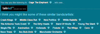
Similar to the 'Cage The Elephant' website we wanted to make something simple and easy to navigate yet visually interesting and involving, to do this we created a obvious navigation bar yet filled the website with photos and videos to create a both visual and informative website.
Album Cover
Our album cover follows many conventions of real album covers. For example, we have a constant American theme throughout the piece, shown by the highway and billboards as well as this we also show all the necessary band information required by a debut album both on our front and back cover such as the band name, album title, barcode, institutional information, record label and track list.

We challenged conventions of debut album covers by having our band members faces obscured by cartoonising them, we feel this creates a sense of mystery about the band members which would encourage people to purchase the album to find out more about the band or subsequently visit the website, all of which would give them exposure to our music.
Here are some relevant videos which we 'used, developed and challenged':
We drew particular inspiration from this video and adapted both its style and concept to our idea. The video has a very casual, 'proffesional home movie' style of camerawork in which we tried to use in our own video. The camerawork is often static, front on and has the actors directly addressing the camera representative of a 'webcam'. We decided to use similar shots within our video to create a similar professional yet home made feel to the video to create a friendly and approachable band image (as shown below).

The video creates comedy through featuring famous figures from YouTube, and thus popular culture, interacting with the band. We developed this idea and decided to take it a step further by using famous villains as members of the band. We believe this would create a positive band image as all the characters are particularly popular and also adds elements of comedy to the video, showing potentially scary characters making fools of themselves.
OK Go have become renowned for their success with creative and inspired music videos. When developing our idea we took into account many of the techniques they use in post production to create visually interesting videos. The video 'Get Over It' was created very early on in their career when they were just starting to try new things with their videos.
What I drew particular inspiration from in this video was the use of lyrical visual aids, jump cuts and lens flares. Keeping these shots and techniques in mind I decided to develop the idea of visual aids. Instead of being blunt and showing a picture picture of 'hay' on the line 'Hey!' we decided to storyboard a more subtle form of visual aid where on certain lines a character or actor would do something that connotes the lyric. For example, on the line 'What I saw I almost couldn't comprehend' we show The Joker clutching his head and shaking it. We also used jump cuts and lens flares often which are very common editing styles used in music videos from our genre as they have strong connotations with a party/festival lifestyle.

Arctic Monkeys are an example of a successful band from the same genre as us. Despite being very successful they are are very conventional in terms of style and image. Indie/Alternative bands are often very bland, they look like normal people just playing instruments, which is appealing to their fans as it makes for a friendlier and approachable image and it becomes almost cool to appear normal and making it 'all about the music'.
This is shown in this music video were a man plays the drums until his hands bleed. This connotes a very serious feel to alternative bands as it is normally all about playing good music without creating a spectacle and just enjoying it for what it is. We wanted our band to be similar to this, however, in our video I believe we challenge this convention as our video is comical and does not take itself seriously at all, in fact, I would say we are the exact opposite, there are many occasions when the band members are just having fun and ignoring the music. This makes the video feel all about just enjoying yourself to the music rather than enjoying the playing of it.

Vernallis's Analysis
When editing our video we took into account many of the forms and conventions vernallis describes. For instance, we broke many rules of continuit editing such as jump cuts, irregular angle sequences and breaking the 30 degree rule. These editing techniques served to make the video more visually entertaining.
We also use vernallis's idea of narrative conventions, having no clear ending to the music video adds to the mystery and message of the video as it leaves the audience with something to think about, for example when the lead wakes up at the end of the video, was it all a dream? where did the villains go?
We also use vernallis's idea of narrative conventions, having no clear ending to the music video adds to the mystery and message of the video as it leaves the audience with something to think about, for example when the lead wakes up at the end of the video, was it all a dream? where did the villains go?
Website
Our website follows a number of conventions, it coordinates with the album by featuring all the band members and also the same american highway, this strengthens the bands image.
It also has many links to information about tours, albums, singles, blogs, band members and other useful websites such as YouTube, Facebook and the bands production company. We have developed on older websites by utilising web 2.0 to allow audiences to interact with the band to a greater extent than usual, we have created an online store filled with STA merchendise, blogging sections which allows users to leave comments for the band and a competition page giving fans the oppertunity to win personalised gifts.

Similar to the 'Cage The Elephant' website we wanted to make something simple and easy to navigate yet visually interesting and involving, to do this we created a obvious navigation bar yet filled the website with photos and videos to create a both visual and informative website.
Album Cover
Our album cover follows many conventions of real album covers. For example, we have a constant American theme throughout the piece, shown by the highway and billboards as well as this we also show all the necessary band information required by a debut album both on our front and back cover such as the band name, album title, barcode, institutional information, record label and track list.

Question 2 - How effective is the combination of your main product and your ancillary texts?
We create a synergystic campaign between our two ancillary products with the same american highway and red, white and blue themes cropping up all over our website and album cover. This creates a strong band identity and also allows our target audience to recognise our bands image in future.


We maintain the band image throughout all three products promoting a care-free and silly band image, featuring pictures on the website of the band members pulling faces to the camera, wrestling and dancing. This is also supported by our album cover and video, the inner cover of the album features stupid faces and the video concept is just so whacky and ridiculous it connotes a cheeky and mischievous image.

Our merchandise, shown on the website, aids our band identity as it features the band name clearly on all items and also shows characters from the music video on the t-shirt. This nicely combines advertisement with band identity.


We linked our music video to our album cover and our website by using the costumes the band members were dressed up in and featuring them on the inner cover of the album and within the gallery on the website.

We decided to create a sense of enigma about the band by covering up two of the members faces and by 'cartoonising' them on the front, and back, of the album. This served to encourage the purchasing of the album and also sparked interest with our audience which caused many to visit our website to find out more about the band. This theme of mystery within our main text and ancillary products was well received by our target audience as they claimed it 'made us (them) want to know more about the band'.
The website, album and music video all support each other. The music video is constantly referenced on the website with links to YouTube, The Live Music Video Premiere and even iTunes where fans can even purchase the video. As well as this the album cover also contributes greatly to the website, it features all the institutional details and even lists the website and the record labels website.
Our record label Sync Or Swim features throughout our products, this gives us a solid brand image and maintains a synergistic relationship with the production country, as not only do they support our band but our product supports them.


We maintain the band image throughout all three products promoting a care-free and silly band image, featuring pictures on the website of the band members pulling faces to the camera, wrestling and dancing. This is also supported by our album cover and video, the inner cover of the album features stupid faces and the video concept is just so whacky and ridiculous it connotes a cheeky and mischievous image.

Our merchandise, shown on the website, aids our band identity as it features the band name clearly on all items and also shows characters from the music video on the t-shirt. This nicely combines advertisement with band identity.

In answer to the question, I believe that the three products interlink particularly well. The website acts as a hub for the other two products and promotes and encourages the audience to explore and take interest in the content our band provides. The use of the website to encourage the purchasing of other products is a clear example of the effectiveness of the combination of our products.
The prominent American theme gives our band a strong and memorable image, the band members are always portrayed in a similar way appearing cheeky and fun in every product.
The prominent American theme gives our band a strong and memorable image, the band members are always portrayed in a similar way appearing cheeky and fun in every product.
If I were to do the project again I believe I would have taken into account the link between the video and the album cover as their is not a whole lot of synergy between the two, aside from the costumes on the inner cover, however I do not deem this to be too strong a problem as the band is featured in a similar way to in the video and the album cover serves to strengthen this image even more.
Question 3 - What have you learned from your audience feedback?
Our audience demographic is that of 16-24 year olds as our band image would be, and has been, deemed too immature for people any older than that. Small Town America is very performance and image based, we are all about having a good time and not caring about what other people think, this style of band lends itself particularly to playing at festivals as they can get the crowd going and just promote the whole vibe of 'free-spiritedness'. We reasoned that teenagers and young adults are the prime demographic of festival go-ers making our audience and band image work together in synergy.
We have also appealed to a secondary audience of younger teenagers who aspire to be like our target audience when they are older. This was through the care-free immaturity our band promotes through its music video and subsequent ancillary products. Our genre is very broad and therefore our music can appeal to both males and females what with the band being all men it is more likely that they will appeal to males through their music and females through the band image.


To gather audience feedback we had arranged a screening of our music video in a studio with theater seating. Around 100 people turned up and from them we took a focus group of 10 people to fill out questionnaires about the video. We made sure to have a variety of people within the group as to make sure we had covered most demographics.
From the samples of audience feedback we received very positive and encouraging responses. however their were a few questions concerning the beginning and end of the piece.


Although very positive feedback it appears that the beginning of the song was too slow in its build up and the end was 'unclear' and as shown in our audience response video people were unsure when it ended with a small round of applause just before the real end.
Our target audience positively however the higher end of the spectrum seemed to not enjoy the song itself, often claiming they would not buy the single/album as the genre is not too their liking for example, Rob a 25 year old who I asked to evaluate our video said 'I don't like the song' and 'Its not serious enough'. Despite the older half of our target audience not enjoying the song I still feel we have targeted our audience successfully and we had a superb response during and after our screening.
Our target audience positively however the higher end of the spectrum seemed to not enjoy the song itself, often claiming they would not buy the single/album as the genre is not too their liking for example, Rob a 25 year old who I asked to evaluate our video said 'I don't like the song' and 'Its not serious enough'. Despite the older half of our target audience not enjoying the song I still feel we have targeted our audience successfully and we had a superb response during and after our screening.

From the responses to our music video I am happy to say that we have successfully targeted our audience and whilst having a very niche concept, a non-serious indie alternative band, we still have a broad appeal to not just our intentional audience of indie bands but to most teenage music fans of Rock, Indie, Pop and Alternative. I believe this broad appeal was due to the comedy and intertextuality of the piece. The use of popular culture characters appeals to a broader audience and by juxtaposing their evil image with doing mundane and childish things helps enforce the comedy of the piece.


Album Cover
We also handed out questionnaires about our album cover to our focus group. Many people liked the effects we had put on the landscape and the band members saying that 'the colour scheme is eye-catching' and the band members look 'laid-back and cool'. As for the inner cover of the digipack many people thought it was original and said that by keeping the colour scheme running throughout it really emphasised the band image.
We had great responses from everyone even from adults who were not fans of the genre saying that the albums greatest strengths was its visual aesthetics. It is clean, colourful and eye-catching which means it will be picked up off the shelves and looked at. This means even if people do not purchase the album they are still aware of the band.

Our website was centred around the concept of interactivity to gratify the needs of the consumer. We recieved alot of positive feedback concerning the merchendise saying that it was stylish yet symplistic aswell as comments about the whacky, scrapbook style and colour scheme of the website. Many people picked up upon the highway, which was also on the album cover, and said that they now accosiate the open road and touring with Small Town America.


From my audience feedback I have learnt the importance of clarity in all media products. If people are in anyway confused or unsure about a media product they will not bother purchasing it or even picking it up.
I have learn't that we successfully targeted our target audience in terms of all three products by making them bright, interesting, visual, engaging and entertaining. Aswell as this I learnt that there are many ways to broaden my products overall appeal to people through Goodwins idea of intertextual references and also the use of physical comedy, which extends to all demographics as it is universally understood.
Question 4 - How did you use new media technologies in the construction and research, planning and evaluation stages?
We used new media technologies throughout this project, many we were familiar with and a number of which we had never used before. We highlight upon these in the video below.
A main difference for me was the difference in camera, the editing software and the website creation site, Wix. We also utilised a number of social networking sites available on web 2.0 such as Facebook and Twitter as well as Skype Conference calls which we used to keep in touch and brainstorm online.
Research
We relied heavily on web 2.0 in the early stages of research using YouTube and Vevo to view music videos online as well as using links of those pages to get to band websites. A particularly useful website was www.Tastekid.com a website that generates similar bands to ones you are listening to. This made our research particularly efficient as from one website we could immediately get an idea of what genre and style of band we would have to be like to suit the track we had selected.

Construction


During editing we used Adobe Premiere Pro CS4, I am semi-familiar with this programme as we used it last year however being in a smaller group this year I really got a chance to experiment with editing and using different visual effects and colour grades to saturate the footage.
We also used many new technologies to create our ancillary texts.
We used a new programme called Wix to create our website, This was entirely brand new to me, it was challenging and confusing at first but as I became more accustomed to utilising the templates and flash links provided by the programme, things finally came together. Wix was generally a very useful tool it allowed us to create a visually interesting and interactive website. The use of galleries and widgets allows the creator to make something interesting without difficult html codes.

Photoshop CS5 allowed us to create realistic looking album covers easily and efficiently. I used www.DaFont.com to download the fonts we used on the album as well as the ones on most of our merchandise.

A main difference for me was the difference in camera, the editing software and the website creation site, Wix. We also utilised a number of social networking sites available on web 2.0 such as Facebook and Twitter as well as Skype Conference calls which we used to keep in touch and brainstorm online.
Research
We relied heavily on web 2.0 in the early stages of research using YouTube and Vevo to view music videos online as well as using links of those pages to get to band websites. A particularly useful website was www.Tastekid.com a website that generates similar bands to ones you are listening to. This made our research particularly efficient as from one website we could immediately get an idea of what genre and style of band we would have to be like to suit the track we had selected.


Planning
As a group we stayed in contact over Facebook and Skype showing storyboards and ideas over video calls. This meant as a group we never stopped sending each other ideas making the planning stage develop ideas organically as we kept adding to each others ideas and developing even when not sat down at a desk.
We utilised new technology most in the construction stage. In the productions stage of the music video we used a new type of camera, the .........
We also got to light our sets on our own for the first time, this proved difficult, but we learnt much about different forms of lighting and how to halo a character.
We also got to light our sets on our own for the first time, this proved difficult, but we learnt much about different forms of lighting and how to halo a character.


During editing we used Adobe Premiere Pro CS4, I am semi-familiar with this programme as we used it last year however being in a smaller group this year I really got a chance to experiment with editing and using different visual effects and colour grades to saturate the footage.
We also used many new technologies to create our ancillary texts.
We used a new programme called Wix to create our website, This was entirely brand new to me, it was challenging and confusing at first but as I became more accustomed to utilising the templates and flash links provided by the programme, things finally came together. Wix was generally a very useful tool it allowed us to create a visually interesting and interactive website. The use of galleries and widgets allows the creator to make something interesting without difficult html codes.

We managed to get our hands on photoshop CS5 for editing our album cover, we got to grips with it pretty fast and it allowed us to use adjustment layers over images such as 'vibrance' and 'luminosity' to give the images more colours and impact. The new version of photoshop made everything faster and easier to use such as the 'artistic' colour tool which allowed us to turn the band members and surroundings into cartoons.

Photoshop CS5 allowed us to create realistic looking album covers easily and efficiently. I used www.DaFont.com to download the fonts we used on the album as well as the ones on most of our merchandise.
Evaluation
We used lots of new media technology in our evaluation, many of which we ave already mentioned, for example we recorded and edited our response above, we used Facebook and YouTube to moniter who was consuming our products and who 'liked' them as well as using www.SurveyMonkey.com and monitering peoples opinions of our products (mentioned in Q3). Using New media allowed us to reach a vaster audience much faster than ordinary.
Friday, 16 December 2011
Lyrics from our Music Video
I was walking down the street,
When out the corner of my eye
I saw a pretty little thing approaching me.
She said "I've never seen a man
Who looks so all alone,
Could you use a little company?
If you can pay the right price
Your evening will be nice,
And you can go and send me on my way."
I said "You're such a sweet young thing
Why you do this to yourself?"
She looked at me and this is what she said:
"Oh, there ain't no rest for the wicked,
Money don't grow on trees.
I got bills to pay,
I got mouths to feed,
There ain't nothing in this world for free.
I know I can't slow down,
I can't hold back,
Though you know, I wish I could.
No there ain't no rest for the wicked,
Until we close our eyes for good".
Not even fifteen minutes later
I'm still walking down the street,
When I saw a shadow of a man creep out of sight.
And then he sweeps up from behind
And puts a gun up to my head,
He made it clear he wasn't looking for a fight.
He said "Give me all you've got
I want your money not your life,
But if you try to make a move I won't think twice."
I go like "You can have my cash
But first you know I got to ask
What made you want to live this kind of life?"
He said "There ain't no rest for the wicked,
Money don't grow on trees.
I got bills to pay,
I got mouths to feed,
There ain't nothing in this world for free.
I know I can't slow down,
I can't hold back,
Though you know, I wish I could.
No there ain't no rest for the wicked,
Until we close our eyes for good".
Now a couple hours have passed
And I was sitting at my house,
The day was winding down and coming to an end.
So I turned on the TV
And flipped it over to the news,
And what I saw I almost couldn't comprehend.
I saw a preacher man in cuffs he'd taken money from the church,
He stuffed his bank account with righteous dollar bills.
But even still I can't say much
Because I know we're all the same,
oh yes we all seek out to satisfy those thrills
"Oh, there ain't no rest for the wicked,
Money don't grow on trees.
We got bills to pay,
We got mouths to feed,
There ain't nothing in this world for free.
I know we can't slow down,
We can't hold back,
Though you know, we wish we could.
No there ain't no rest for the wicked,
Until we close our eyes for good
Album Cover
When designing the album cover I took into account the attributes of our band that made us different from other indie/alternative bands. We were care-free, cheeky and fun. Wanting to reflect this in the album artwork we decided to turn the band members into cartoons, this gave off the impression of immaturity and makes the whole thing seem non-naturalistic going hand in hand with the surrealism of our music video.
To construct the album we used Photoshop CS5, Its new colour effects such as 'vibrance' and 'luminosity' allowed us to make the album appear more eye-catching and colourful.
We used www.dafont.com to create the fonts used on the spine and on the billboards.

To construct the album we used Photoshop CS5, Its new colour effects such as 'vibrance' and 'luminosity' allowed us to make the album appear more eye-catching and colourful.
We used www.dafont.com to create the fonts used on the spine and on the billboards.
Wednesday, 14 December 2011
Final Shoot

Second Shoot

The day before the shoot the actor we had originally used for Darth Vader had broken his wrist. This was not an issue, for us, as he was the one character we could afford to replace due to the fact that none of his body, face or clothes are shown. Leo kindly agreed to step in on short notice and couldnt have done a better job. With Leo briefed by Phillippa, who was directing the shoot, things moved pretty quickly.
We had also brought in the media technician from our school to sort out the various light set-ups before each scene as well as helping us with any technical issues with the camera.
We were fortunate enough to get all the footage we planned to film as well as some extra handheld shots of the band performing.

First Shoot

 It was good to finally get some decent footage which we could work with, We still weren't 100% happy with the lighting as there was alot of unnecessary shadows throughout the footage as well as some shots were the lead singers face is too highly exposed to the lighting.
However, despite the various lighting issues a lot of the footage has been pleasently suprising with a stylistic film grain and decent, continious colour grade which will save us time in editing.
We have planned a few re-shoots for next week as we want to get the lighting perfect as well as using more exciting types of shots, possibly more handheld and tilted angles.
Test Shoots
After our test shoot we realised lighting and space were going to be a real issue. We at first noticed during the shoot that the original set was way too detailed and had bedside tables, clothes and general room clutter all over the place. The oiginal intention was to make the set appear realistic and 'lived-in' however this soon became difficult to maneuver around and we made sure to remove many of the props in the room and keep a simplsitic and stylysed set.
We only realised lighting was an issue during our editing session the next morning where we realised that the poor an dark lighting had created a grain on the camera which affected the continuity of each shot and made an undesirable visual pixelation on the footage.However, we decided the idea of a film grain on the camera would attribute to the 'proffesional amateur' style we wanted where it would look like a home movie whilst appearing proffesionally produced.

We only realised lighting was an issue during our editing session the next morning where we realised that the poor an dark lighting had created a grain on the camera which affected the continuity of each shot and made an undesirable visual pixelation on the footage.However, we decided the idea of a film grain on the camera would attribute to the 'proffesional amateur' style we wanted where it would look like a home movie whilst appearing proffesionally produced.

Wednesday, 16 November 2011
Coming up with ideas
To come up with Ideas we sat in a group and first discussed what type of genre we would most enjoy to make a music video around. At first we had decided on american punk rock as we thought that this would be the most fun to produce as those videos are often quite ridiculous and entertaining to watch. Main examples being Bowling for Soup and Sum 41.
However, after much consideration we decided to go for an alternative music genre. We decided upon three songs, The Great Escape, I Want You and Ain't no Rest for the Wicked.
We listened to the lyrics and decided to create a song around the subtext of the music.
However, after much consideration we decided to go for an alternative music genre. We decided upon three songs, The Great Escape, I Want You and Ain't no Rest for the Wicked.
We listened to the lyrics and decided to create a song around the subtext of the music.
Final Idea
Our Final Idea is to use the song 'Ain't No Rest For the Wicked' by Cage the Elephant. The idea of this video is that the lead singer cannot sleep and through the duration of the song 'the wicked', famous villains, slowly enter his room and try to get to sleep with him.
We think that by juxtaposing the evil characters reputations with sucking their thumbs will create comedy and also appeal to a broader audience through the use of a broad selection of popular culture characters.
Compared with our other ideas we reasoned that this video gives us the most space to play around with different ideas and best utilises our sense of humour.
Wednesday, 5 October 2011
Brainstorm
A very brief outline of our initial idea. Features the song 'That Girl' by All Time Low and our ideas for and ending.
Thursday, 22 September 2011
Director Case Study
Francis Lawrence - Is a successful Music video and Film director. Working in the business since 1993 Lawrence has directed numerous films, commercials and songs including the award winning Lady Gaga song 'Bad Romance' and enjoyed success directing 'I Am Legend'.
Researching about Lawrence I discovered he has covered many genres of music with a list of over 20 substantially successful artists such as Shakira, Missy Eliot and OK Go. Lawrence uses very provocative imagery and has successfully altered the image of many A-Listers causing them to appeal to a wider audience. For example, in Britney Spears video "I'm a Slave 4 U" , Lawrence managed to transform Britney's girl next door image into something more overtly sexual, showing her promiscuously dancing in a crowded sauna. The strong, memorable images that Lawrence projects for his clients is a necessity to success. I hope with the correct image I could reach a broad target audience and still access niche markets.
Lawrence directed The Black Eyed Peas song 'Let's Get It Started' in June 2004. The video takes place in a night time setting in an urban area. With the whole band, particularly Will.I.Am, performing extremely fast-paced energetic dance moves while singing the song. During this various objects fall in the background (including a grand piano), these smash against the ground in varying effects and speeds (especially in slow and fast motion and even in reverse). This idea of energy and excitement is something I would like to incorporate into my music video as I aim to make my video as visually exciting and interesting as possible as to engage my audience.
Lawrence uses suspense within OK Go's video 'Get Over It' to exaggerate the musical 'Drop'. This adds elements of comedy and also an extra element to the music that you would not get if just listening to it. He juxtaposes the energy of the bands performance with the tranquil and relaxed way in which they later play table tennis, the immediate cut between them at 1:55 creates comedy and suspense for the consumer as they find themselves having an intake of breath for when the music starts again. I would want to incorporate something like this into my video as to encourage my audience to watch the video for a better experience than merely listening to the song.

Album Covers

1. What are the typical features an album cover has?
- The Artist(s) feature heavily (especially on debuts)
- Eye-catching Imagery
- Album name
Back Cover
- Track list
- Institutional Information (Bar code, Label etc.)
2. How would you categorise the covers? Are there any other ways of distinguishing between them other than generically?
 Many well-known bands seem to abandon the idea of featuring the artists on the cover and forgo that for a more interesting visual that is perhaps eye-catching or memorable. For example, many people recognise The Arctic Monkeys album cover of the man smoking and this is not due to an interesting concept but that the band is very well-known so the people are often exposed to the imagery of the album meaning it sticks in their mind. This is the same with both The Beatles and The Killers albums which are simple yet memorable. The majority of the covers (aside from the beatles montage) are from a music movement in the 2000's and the pattern appearing seems to favour simplicity in album covers.
 3. Album covers serve many different functions. What do you think these are?
Album covers serve to entice potential buyers of the album, they are often visually interesting and are designed to be eye-catching. They often show off a bands image that the label deems to be aspirational to its target audience. As-well as this the cover and back cover serve to inform the audience of what music is available within the album. The front cover often notifies the buyer of bonus features with band interviews etc that the CD may feature.
Specific Album Cover

This album is simple but I think its successful for it. It shows the band 'hanging out' back stage. It connotes a relaxed, cool side of the band making them appear more human and likable. The old-style effects of a double image makes the album look 'charming' and retro. The text is a modest font and doesnt jump out at you. I believe the cover appeals to its audience as it is laidback and 'chilled' just like the consumer. The back cover is just as simple as the front, It features the album title and songs, its clean look is appealling as it just is easier to look at and is not too strenuous to see excactly what you want to find out. The slight overrun of colour from the front to the back in the top right adds just a slight artistic look to the back and again shows-off the overall modest chic of the album.
Subscribe to:
Posts (Atom)